How to edit a Canva Instagram template without design skills
A template only saves time if you can change it in ten minutes. Here is the order to edit one in Canva — colours, fonts, photos, text — and the three settings that break a set if you touch them.
5 min readUpdated · free to read, no sign-up
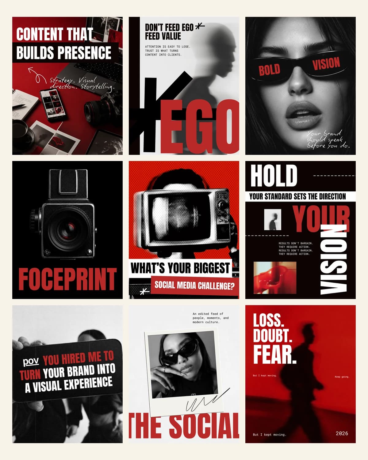
Every template set on this site opens the same way: you click a link, Canva makes a copy in your account, and the original stays untouched. You can edit that copy as many times as you like, and you can make a fresh copy whenever you paint yourself into a corner. Nothing you do is permanent, which is worth knowing before you start moving things.
A free Canva account is enough. Pro adds a few conveniences — background remover, resizing — but no template here depends on them.
Edit in this order
Most people start by rewriting the text on slide one, then spend an hour fixing colours that no longer suit it. Work from the widest change to the narrowest instead:
- 1Colours first. Open the first slide, click a coloured shape, and use the palette that appears at the top. Change it once and Canva offers to apply the swap across the whole design — take that offer.
- 2Fonts second. Click any headline, then the font name in the toolbar. Pick one font for headlines and one for body text, and stop there. Two is a system; four is a ransom note.
- 3Photos third. Drag your own image straight onto a photo frame and it drops into place, cropped to fit. Double-click to move the image inside the frame rather than resizing the frame itself.
- 4Text last. Now that the set looks like you, write the words. Keep headlines to six or seven words so they still read at thumbnail size.
Three things that quietly break a set
- Dragging elements outside the frame. Anything past the edge gets cut when Instagram renders the post, and Canva will not warn you.
- Stretching a photo by a corner handle without holding shift. The proportions go, faces get wide, and it is obvious in a grid even when it is not obvious on one slide.
- Changing the canvas size. A 1080×1350 post resized to a square re-flows every layer on that slide. If you need both shapes, use the post and story versions that already ship in the set.
Exporting so it stays sharp
Use Share → Download → PNG. JPG saves a little weight and costs visible quality on flat colour and type, which is most of what these sets are made of. If you are posting a carousel, download all slides at once and Canva numbers them in order.
Upload to Instagram from the phone gallery rather than through a third-party scheduler's preview if you can — the fewer times an image is re-compressed, the cleaner the type looks.
Keeping a month consistent
The point of a set is that thirty posts share one visual grammar. Pick three colours and stay inside them. Reuse the same headline layout for the same kind of post — offers always bold, tips always on the pale background — so a returning follower recognises what they are looking at before they read it.
When something feels off, it is nearly always contrast: pale type on a pale photo. Drop a dark overlay behind the text, or move the text onto the plain block that the layout already gives you.
Set up a brand kit once, reuse it forever
The second set you edit should take a quarter of the time the first one did, and it will if you write your decisions down somewhere Canva can reach them. On a free account that place is a scratch design: one page holding your three colours as filled squares, your two fonts as sample lines, and your logo. Name it something you will find again.
From then on, editing starts with copying a colour out of that page rather than deciding on one. It sounds trivial. It is the difference between a brand and fifteen designs that were all made on different afternoons — and it is what stops a grid drifting a shade warmer every month without anyone noticing.
If you do have Canva Pro, the brand kit feature does the same job with fewer clicks and adds one-click application across a whole design. The habit matters more than the tool: people with Pro and no decisions still produce inconsistent feeds.
When to edit and when to start again
There is a point where fixing a slide costs more than rebuilding it, and it arrives sooner than people think. If you have moved more than two elements and the layout no longer sits on the invisible grid the rest of the set uses, the slide will read as the odd one out no matter how long you spend on it.
- Text has outgrown its box and you are shrinking the font to make it fit. Cut the words instead — every layout here was drawn against a length, and the length is the design.
- You have added a fourth colour to make something work. It will not work; it will make the other three look accidental.
- You have layered a photo, an overlay, a shape and a caption to solve a contrast problem. Use the layout in the set that already has a plain block behind the text.
- You have spent twenty minutes on one slide. Copy a fresh one from the template link and spend five.
Nothing is lost by starting a slide again, because the original template is untouched in your account and always will be. That is the quiet advantage of working from a set rather than from a blank canvas: the version you have not ruined is one click away.
Still wondering
Questions
Can I edit a Canva template without a paid account?
Yes. A free Canva account opens and edits any template built from free elements, which is how every set on this site is made. Pro adds background removal and one-click resizing; neither is needed to use a template.
How long does it take to edit a whole template set?
An afternoon for a set of fifty, if you work colours, fonts, photos, then text in that order. People who start by rewriting slide one usually spend that long on the first ten.
Will my edits overwrite the original template?
No. Clicking a template link makes a copy in your own account and leaves the original untouched. If you paint yourself into a corner, click the link again for a clean copy — as many times as you like.
Can I use my own fonts in a Canva template?
On the free plan you can pick from Canva's font library; uploading a brand font is a Pro feature. Choosing the closest free equivalent and applying it across the set takes about a minute and reads the same at post size.
Why does my exported post look blurry on Instagram?
Almost always JPG export or a re-compression on the way in. Download as PNG, and upload from the phone gallery rather than through a scheduler preview — every extra compression costs the flat colour and type these layouts are made of.
Sets from this guide
Skip the blank page
See every set
Keep reading